FEAR OF COLOUR
Welcome to my first blog post, this is a topic I’m particularly passionate about.
Why are people drawn to a monochromatic interior?
A very common case I deal with is a client that requests a monochromatic palate for their space. Why are people drawn to a monochromatic interior when they have a colourful, bold personality? And why not represent that through your home. It’s easy to commit to a colourful wardrobe but people are paralyzed by the thought of a blue sofa.
I believe a home is the most personal space we encounter on a daily basis. So many of us spend 8 hours + in an office and 2 hours in a car every day so why would you want to come home to a space that doesn’t reflect your personality and livelihood and make you feel like you are part of your home.
I like to think about dressing a home the way you would dress yourself. Thinking about what fits, what emotional responses we get from colour and why we choose certain colours to wear. Fashion and style work in a home the same way they work in your wardrobe. It is less about what is “InStyle” or “on trend” and more about having your own style.
This is important in residential design because it is the most personal sector of Interior Design. People are often afraid of colour because of the idea that a colour will go out of style. I’m here to say, as long as the design is well executed, timeless and the elements and principals of design were followed, the emerald green room you adore will never go “out of style.”
To me, Good style means creating an outwardly expression of your personality and mood. Good designers are able to help manifest that in a home.
Ways to introduce colour:
Artwork
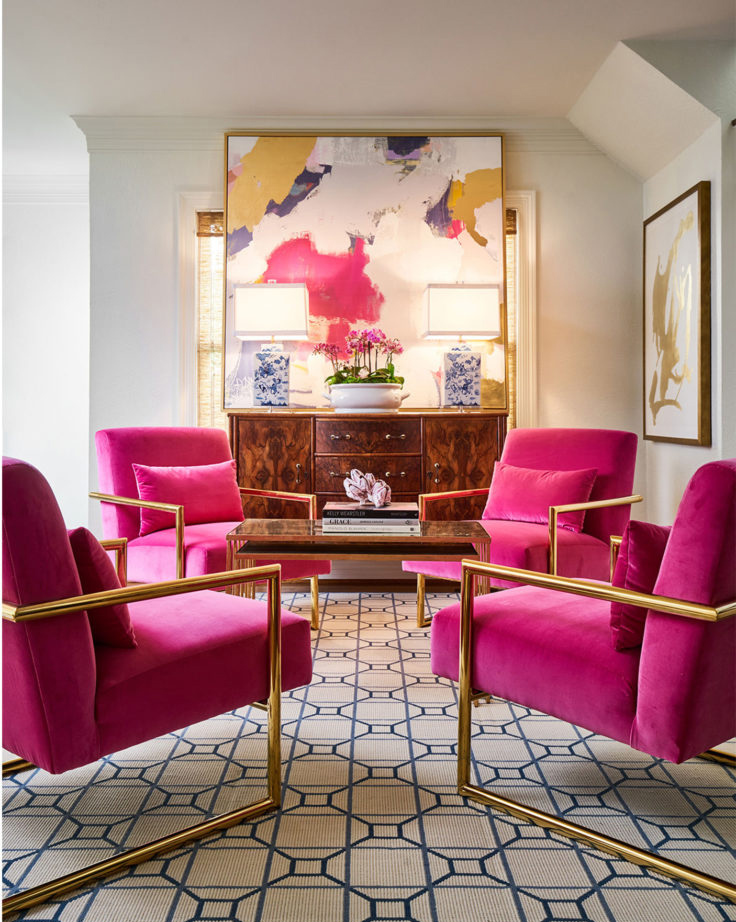
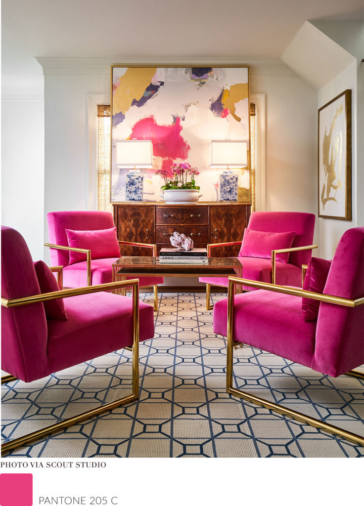
Choose a piece of art or photography that injects a bit of your personality into the space and pull colours from the art out into the space. Using a piece of art as a guide to harmonize a space with the right colours. If you are drawn to a piece of art because you love the colour scheme why not pull out colours from the piece into the space, chances are you will have an easier time committing to the colours if they appealed to you in the painting.
Nature
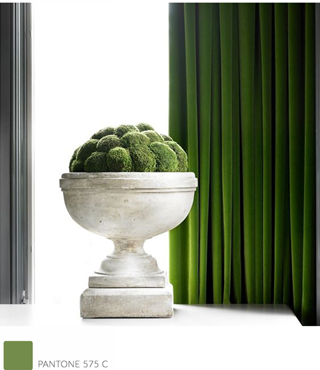
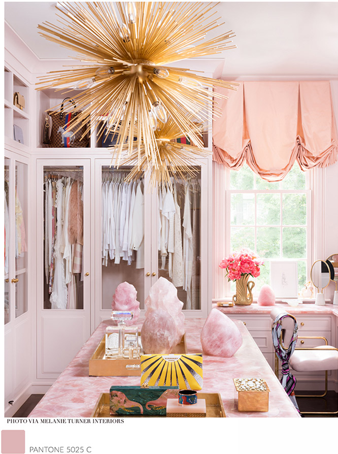
Bring colour into a space by using nature as a resource. This is an easy way for people who fear colour commitment to feel better about selecting a palate. (wood, natural stones, flowers, Plants & greenery) choosing elements from nature is often an elegant yet subdued method of introducing colour and personality into a space. Whether it is a pink slab of marble or some moss adding a pop of green into a room; You can’t go wrong with the fresh sophistication natural elements provide.
.
Inspiration
VERSACE SPRING-SUMMER 2018 RUNWAY
Staying inspired is very important, choosing a reason to introduce a certain colour into your space makes it a lot easier to rationalize and commit to it. Watch fashion shows, pick out a runway piece that you can’t stop drooling over and translate that into your interior. Being inspired by a vacation, or even the landscape your house is situated on can all be great ways to select memorable colour palates.
Everyone has different emotive responses to colour, I think its important we use colour as a tool to make our homes reflect our personality and use it as a language to describe our emotions. Being colour confident doesn’t mean painting your walls Caliente red (af-290), you can still have your Oxford White (cc-30) walls and introduce a bold sofa and textiles, you will still make a strong impact creating contrast with colour while feeling safe about your paint decision. Using colour is likely one of the easiest ways to personalize and instantly change the look and feel of a space.
So why are people drawn to a monochromatic interior?
It’s “safe” everyone is afraid that certain colours will go out of style or they will tire of bold colours, all colours are trendy for a period of time. 10 years ago everyone was obsessed with beige as a neutral, now it’s grey and white that are trendy neutrals, even neutral colours have trend periods. i always tell my clients not to gravitate towards a colour because its trendy, choose a colour because you like it!
Living in a city like Toronto is grey enough 7 months out of the year, Because we don’t get colour from our landscape it is particularly important that we introduce it into our lives in other ways. I’ve done my job if I can motivate and inspire people to show their true colours (Pun intended) and live a more vibrant life at home.